OVERVIEW
Neighborcare Health began in the 1960s as a group of community health centers with a shared vision to make healthcare accessible to everyone. Today, the nonprofit operates more than 25 clinics throughout the Puget Sound, serving some of the region’s most diverse neighborhoods. To continue meeting the needs of a larger population, the organization needed an online presence that allowed current and future staff, donors, and patients to connect with each other and easily access the resources they need.
Using an in-depth, research-based approach, the new website provides an intuitive, user-friendly online experience. The site interface is designed specifically to support individuals with lower literacy levels or with English as a foreign language – a large part of Neighborcare’s patient population.
- DISCOVERY + RESEARCH
- INTERVIEWS
- COMPETITIVE ANALYSIS
- UI + UX
- INFORMATION ARCHITECTURE
- RESPONSIVE DESIGN
- FULL-STACK DEVELOPMENT
- CMS INTEGRATION

Mary Schilder
Director of Marketing Communications
“Engaging imagery of real patients and staff tells our story, while website features and back-end functionality help us meet many needs for highlighting services, marketing, recruiting staff, fundraising and more. The design is also accessible and gives visitors the ability to translate content into multiple languages. Since the site launched, we have regularly received positive feedback about the design and how easy it is to use.”

USER SURVEYS AND PATIENT INTERVIEWS
In order to understand the needs of our target demographic, we began with audience research. To maximize the effectiveness of a limited budget, we developed a custom set of online surveys that staff and donor participants could answer independently. This provided more time to conduct in-person interviews at clinics, with translators to eliminate language barriers.
The results of the surveys and interviews were analyzed, and key insights from each user group were used to guide the design of the new site.

KEY LEARNINGS

PATIENTS
- Mobile-first design accommodates a large portion of patients who rely on mobile devices for internet access
- “Find-a-Clinic” feature streamlines the process for finding care in the patient’s neighborhood

LEADERSHIP & DONORS
- Persistent “donate” button throughout site brings donations to the forefront
- Optimized donation CTA and supporting UX makes the donation process quick and straightforward

EMPLOYEES
- Showcase Neighborcare’s dedication to their mission up front for employee recruitment and retention
COMPETITIVE ANALYSIS
To analyze best practices and find inspiration, we researched like-minded healthcare centers as well as non-profit organizations both inside and outside the healthcare industry. We then pinpointed the strongest strategies for connecting a diverse audience and shared these ideas with the project stakeholders. Together, we identified the goals that were achievable within the current project scope, as well as aspirational goals for future iterations.

INFORMATION ARCHITECTURE
After defining audience needs, internal dynamics, and project scope, we drafted a sitemap and wireframes that reorganized existing content into a clearer user flow and more intuitive navigation for all of our user groups. In a workshop format, we refined this new architecture with stakeholders.


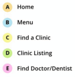
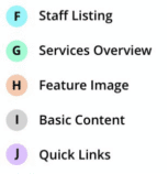
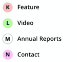
SITEMAP
A color-coded sitemap was developed to identify different content types throughout the site. This provided a clear, visual framework for the new site architecture and content organization. The sitemap also captured functional requirements to support the subsequent wireframing and design phases.

MOBILE-FIRST WIREFRAMES
Our next step was to fully wireframe out each page type and resolving differences in content length. While our approach was mobile-first to accommodate Neighborcare’s patient population, we also developed key wireframes for tablet and desktop to ensure content optimization on larger screens.
MOBILE-OPTIMIZED USER INTERFACE
To support diverse, mobile users, we included features such as Live Text to support translation, key action buttons fixed to the bottom of the window, and compliant touch target sizes improve UI and site accessibility on any device. A modular layout provided extensibility and easy future content updating.

ICON SET
We created a library of simple icons to visually represent Neighborcare’s services, making it easier for patients with low literacy or English as a foreign language to navigate the site and quickly find the information and resources they need.


