DESIGNED TO COMPETE
A new player in pharmaceutical market entrusted us to successfully launch as an independent entity with thoughtfully crafted brand strategy identity at a high profile industry event. They needed a stand-out show presence to steal the spotlight from their much larger, well established industry competitors. The non-conventional exhibit space, supporting marketing materials and ongoing refinement to the brand has enabled them to dominate mindshare from the very first day.
- Brand Strategy
- Naming
- VISUAL BRAND
- Website
- Social Media
- EXHIBIT
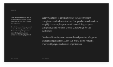
BRAND STRATEGY
By assessing the competitive landscape and interviewing employees, leadership, customers, and partners, we discovered that what made this company unique was not only its customer-centric technology but also the forward-thinking agile product development methods. In short, Verity was the only company able to deliver what customers really wanted: a transparent, actionable view of accurate data. With that insight, we crafted a brand strategy that would embody this value. Thanks to the company’s nimble leadership and committed partnership, we were able to meet aggressive goals within a very short timeline, regularly syncing on priorities, agreeing on decision points, and delegating tasks to get core marketing collateral onto that first show floor with a splash.

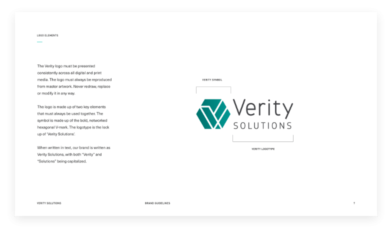
NAMING
We formulated brand pillars and an identity system that reflects fundamental company values, starting with the name—Verity, embodying truth and transparency.
Naming can be a highly subjective endeavor. To arrive at a solution, we explored a wide range of names across three categories: descriptive, conjoined and suggestive. In the end, we all agreed that a suggestive and aspirational name would create the strongest foundation for brand storytelling.
Over time, the company added layers of depth to the meaning and to this day, it feels fresh.
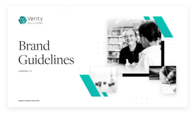
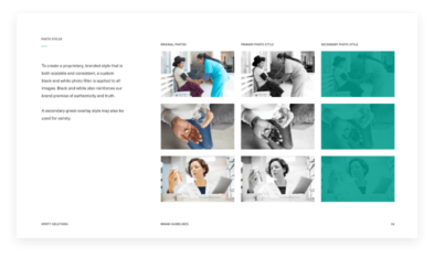
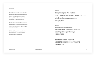
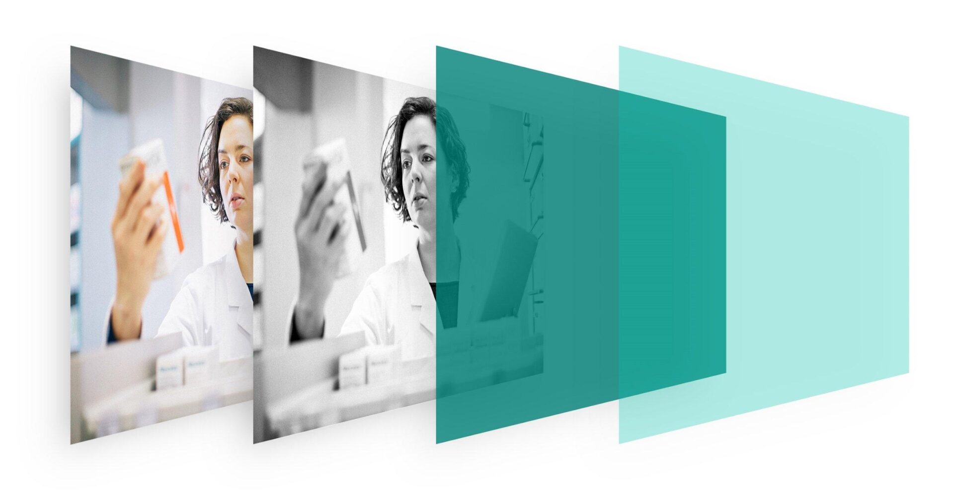
VISUAL BRAND DESIGN
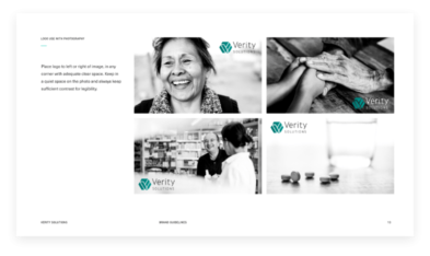
The crisp, modern identity is anchored by a clean white color palette and proprietary black and white imagery, fittingly representative of clarity and transparency. Verity’s brand style guide was created with a consistent, coherent architecture that is recognizable and memorable in every channel and customer touchpoint.

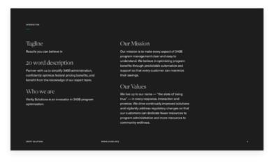

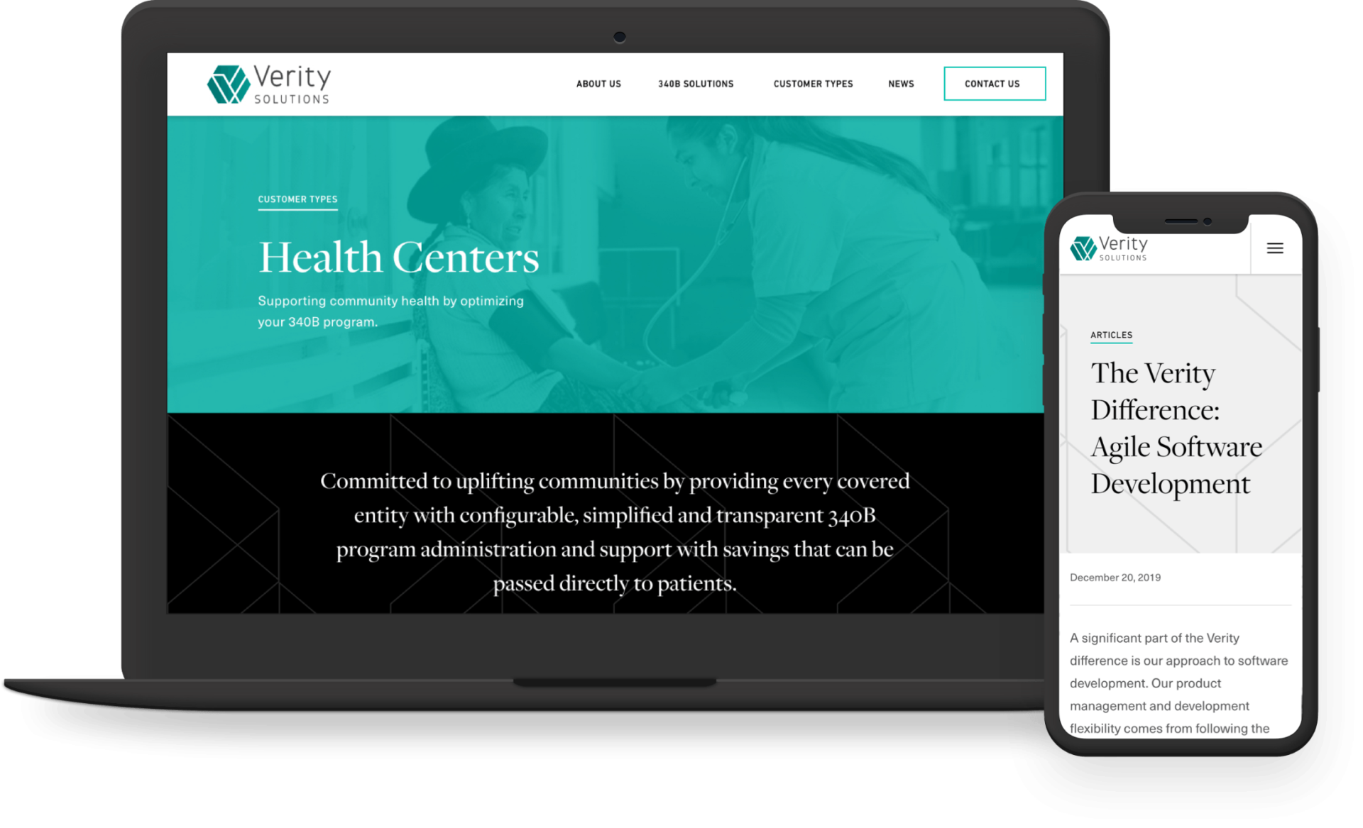
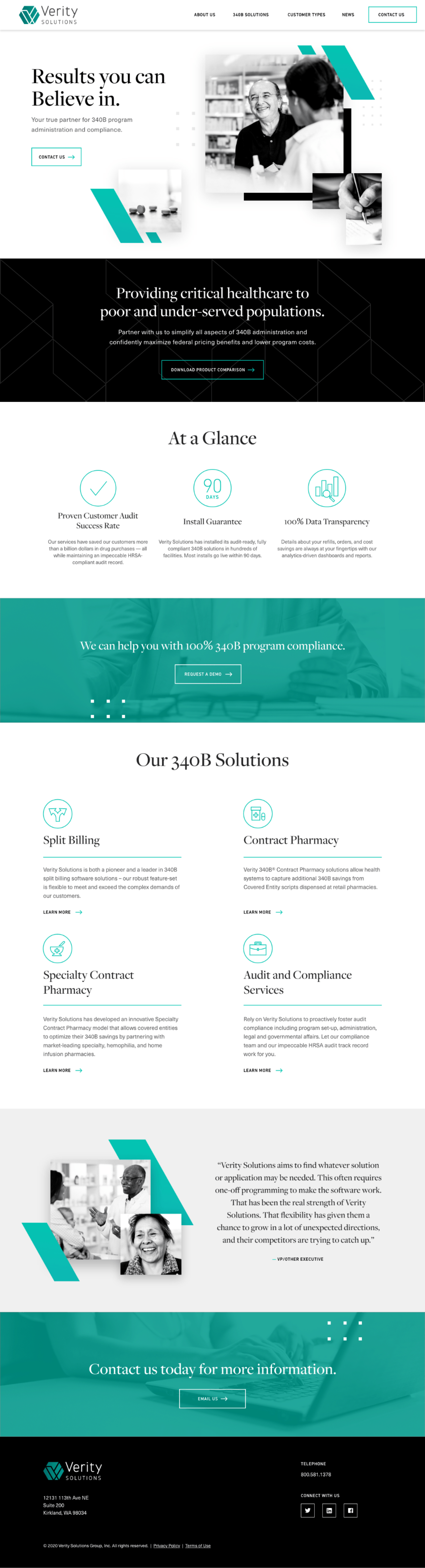
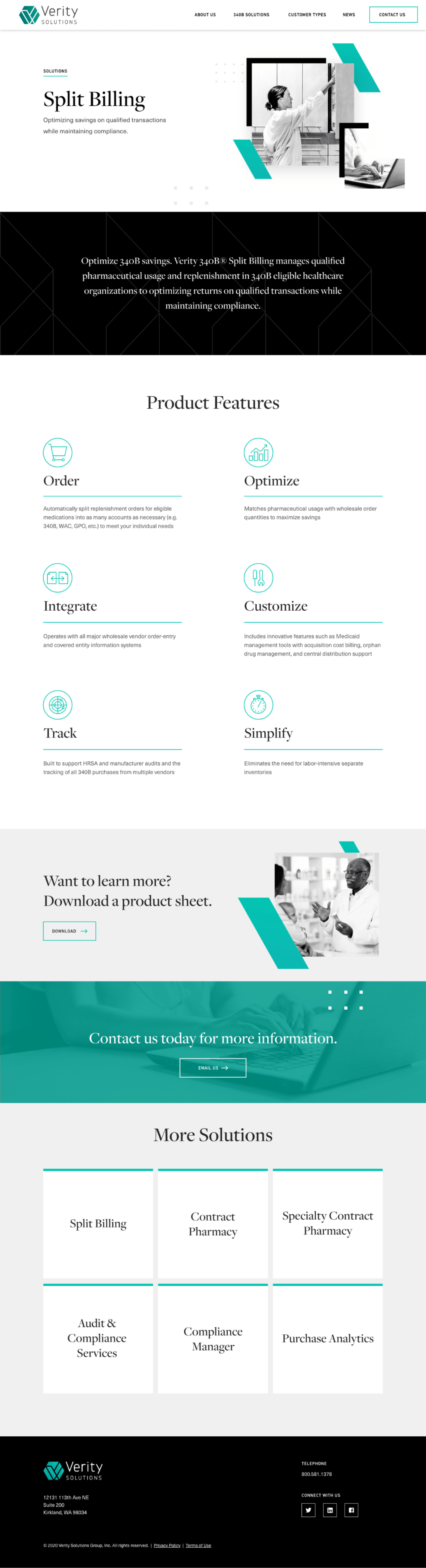
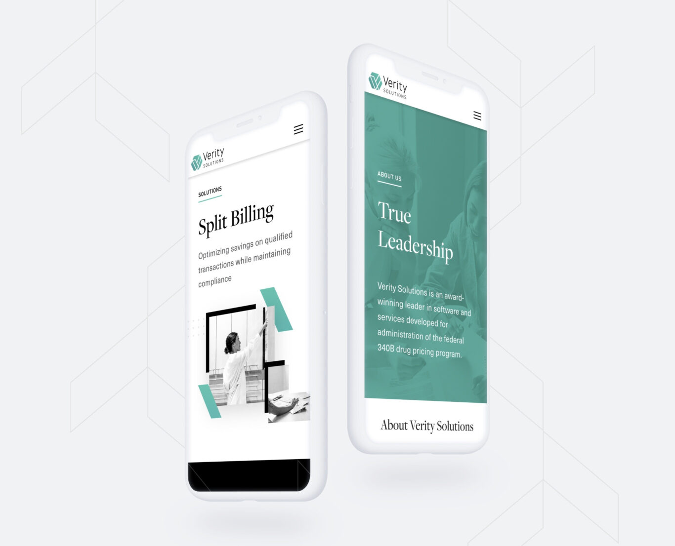
WEBSITE
Verity’s mobile-first website features scannable content blocks that make complex and technical products feel less daunting and more accessible to their target audience. From information architecture to content development, visual design to back-end administration, our approach to interactive design focuses on consistent, compelling experiences and usability across all media types.
george puckett
CEO