A FRESH PERSPECTIVE
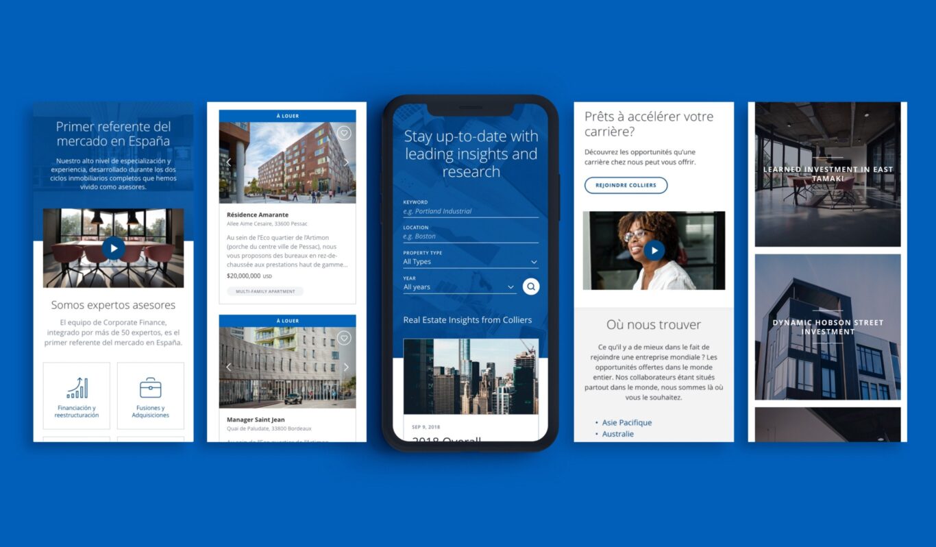
Colliers International is a commercial real estate and investment management organization with more than 400 offices spanning 68 countries. Colliers initially hoped to make a series of small fixes to their existing digital ecosystem that would ultimately resolve an inconsistent variety of global sites, internal tools and marketing strategies.
As we evaluated their goal, we recognized the need for a more holistic solution that addressed the functional requirements of each individual region. The result was a comprehensive design system that unified the user experience across multiple platforms while offering the flexibility, access and customization that each region required.
- Discovery
- Site Architecture
- UX
- UI
- Branding
- Frontend Development
One month after launch, the Canadian site saw:
PAUL BOOTH
SENIOR DIRECTOR OF MARKETING TECHNOLOGY
“We have offices in a wide range of markets and regions. We now have a website that scales to fit the needs of markets of all sizes. It looks great, too, and that’s a real feat.”
UNITED STATES
AUSTRALIA
CANADA
CHINA
UNITED KINGDOM
BRAZIL
INDIA
+61 COUNTRIES
DESIGNING A MODULAR SYSTEM
Our initial discovery phase included a thorough review of Colliers’ needs in the market: What are the highest value services? Who is using the site(s) and what do they need? What distinguishes Colliers in the commercial real estate space? This process enabled Colliers to internally realign and redefine their priorities and differentiators and ultimately set the guardrails for a refreshed visual identity and streamlined marketing strategy.
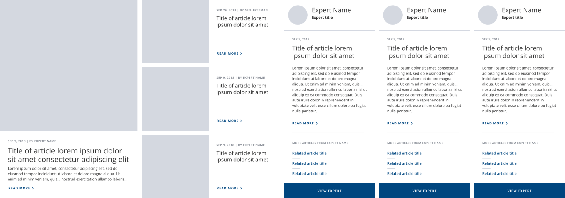
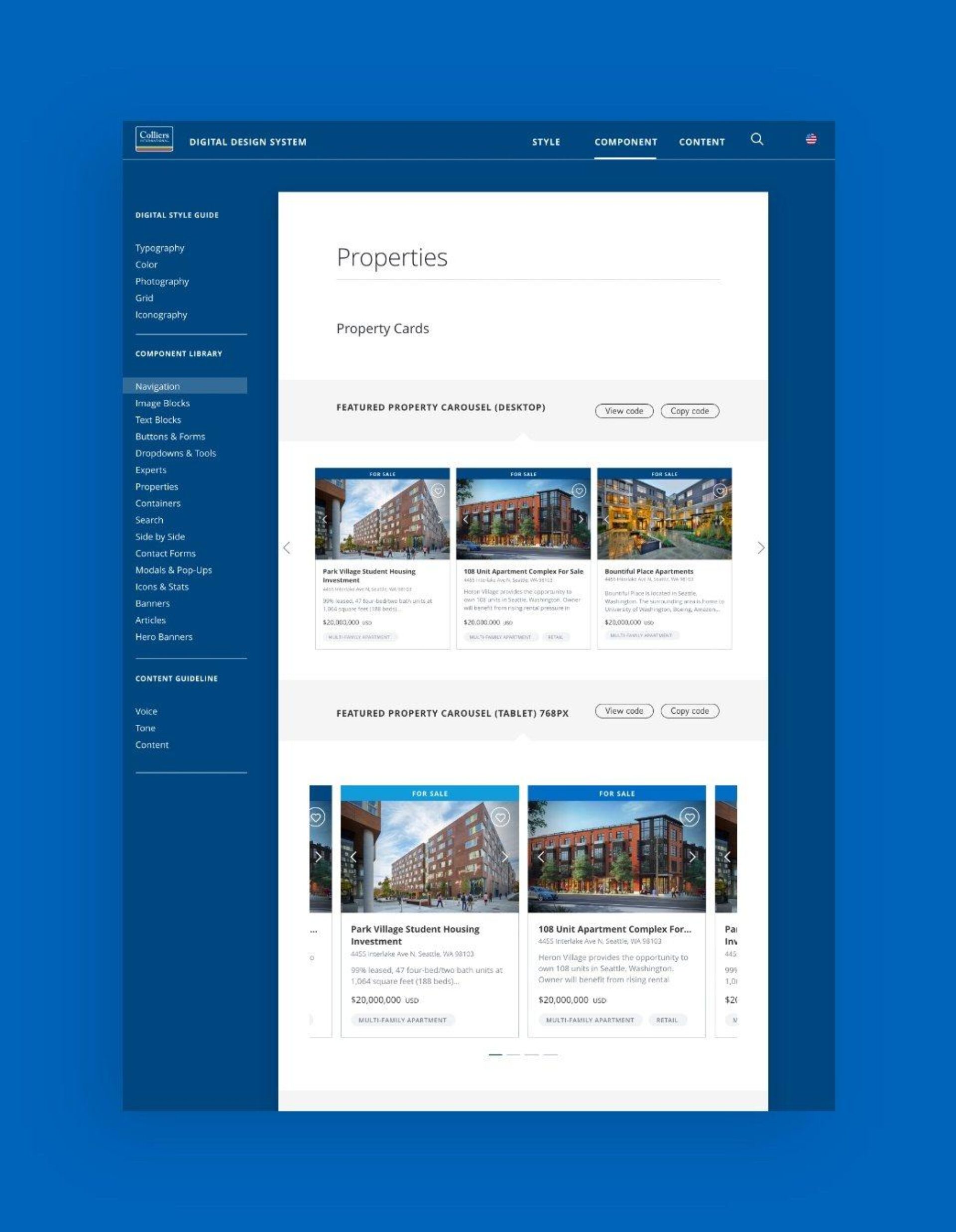
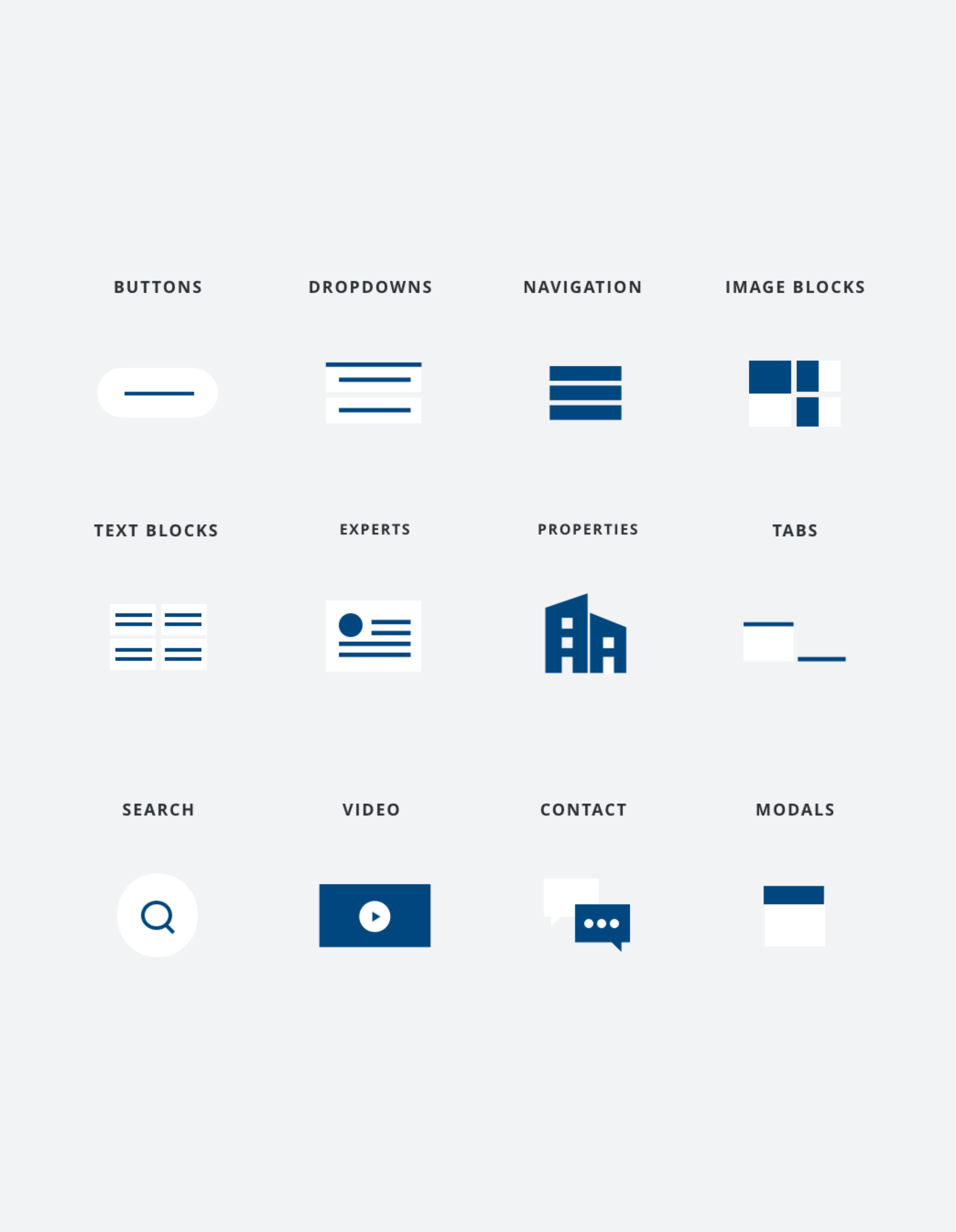
We then moved onto this assignment’s unique UX design challenge: How do you deliver a responsive website template with consistent experience, for use in 60+ countries? Our solution was to create a modular library of digital components that allows each region to handpick the particular modules that address their unique set of business requirements - and create their own brand-compliant templates.
GRANT CARROLL
DIRECTOR, DIGITAL MARKETING STRATEGY
“Graphiti brought responsible UX to the design process. They took our wishy-washy, lacking-in-detail page requirements and kept pushing us to make sure the needs of the user were clearly-stated and well-executed. That has made all the difference.”
REFRESHING THE COLLIERS VISUAL BRAND
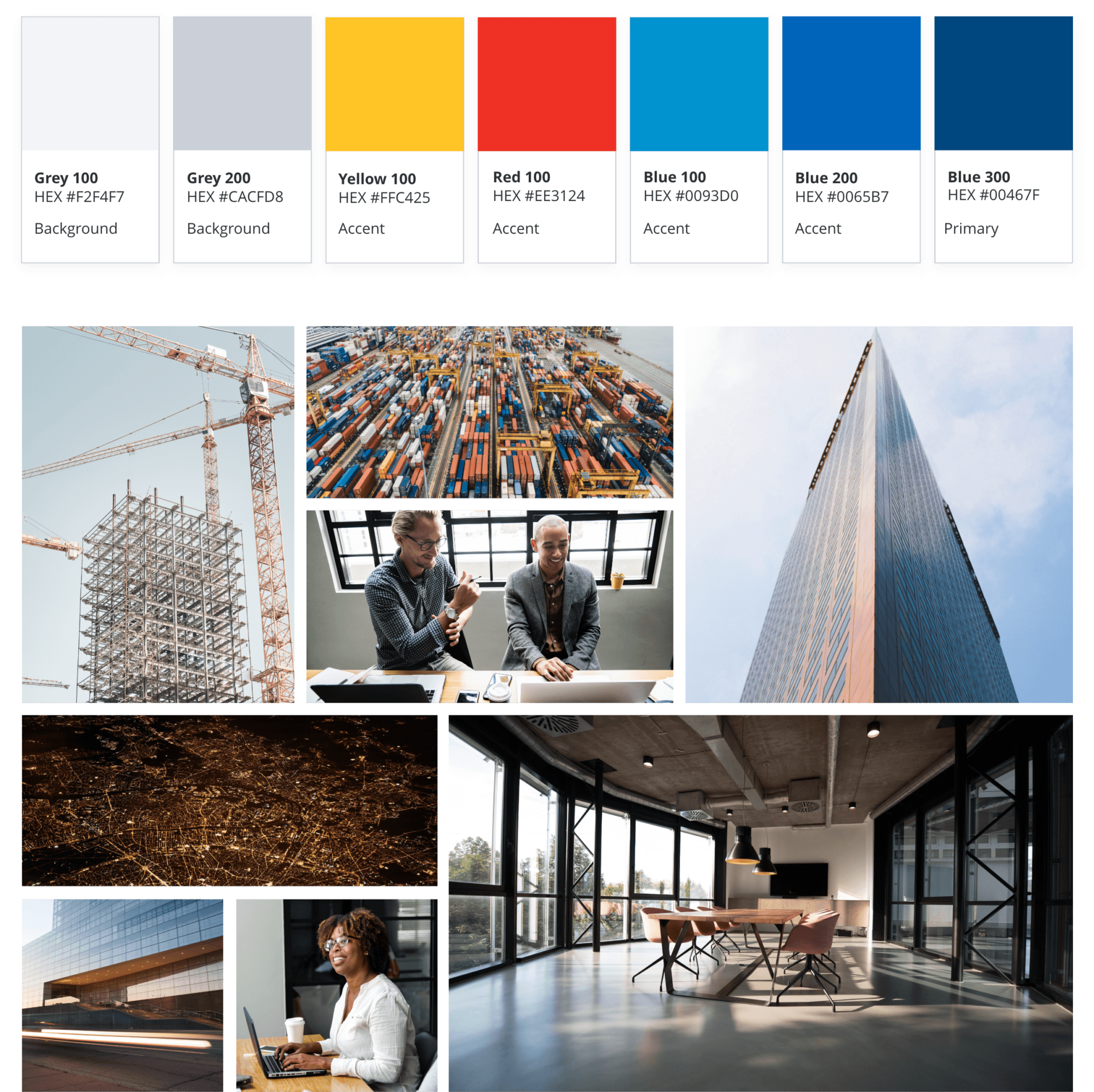
Drawing upon our long working history with the Colliers brand, we identified known gaps in the existing style guide and recognized the opportunity to modernize the brand style. To work quickly, we built on the core visual components of the Colliers brand, reclaimed the Colliers branded blue, selected screen-friendly typography and defined image guidelines to showcase their differentiators.
DELIVERING DIGITAL BRAND CONSISTENCY
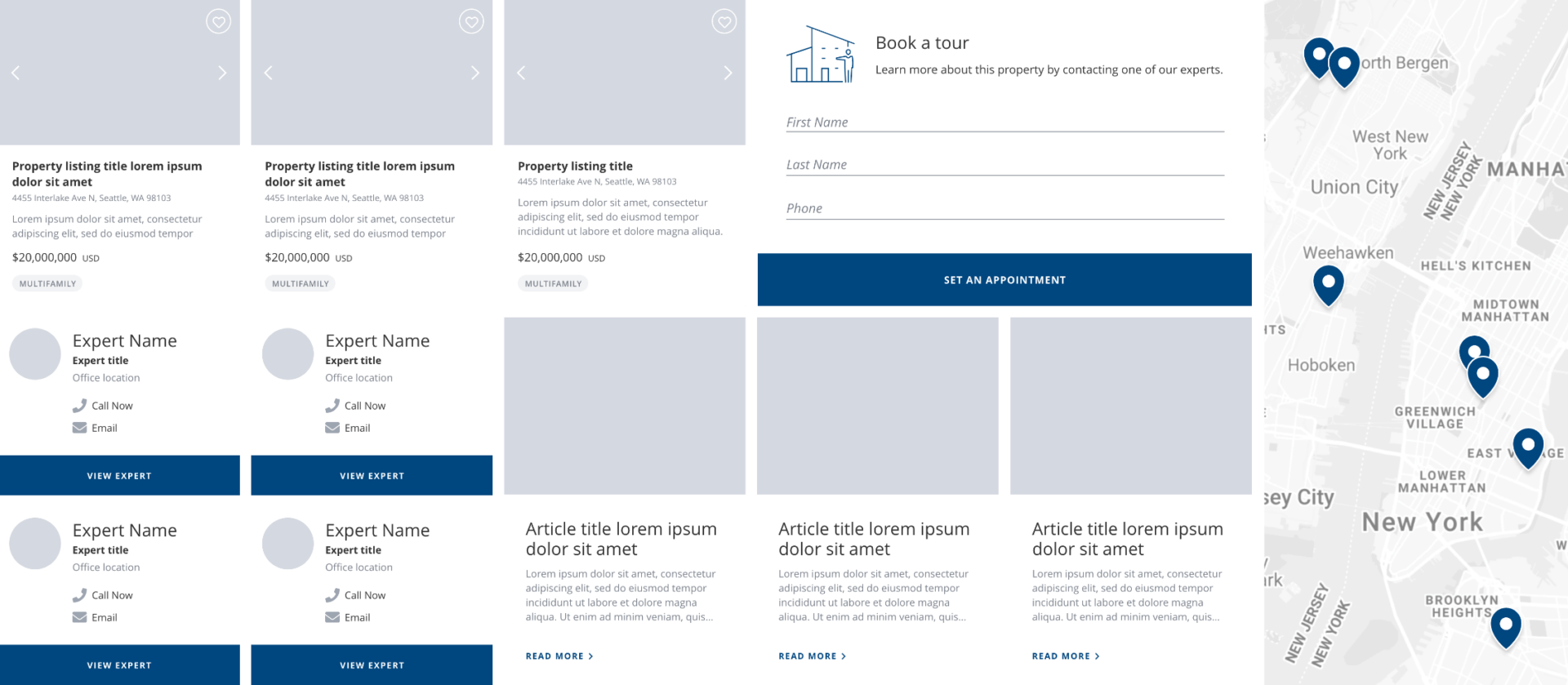
With brand assets defined, Colliers needed a dynamic and consistent way to deploy to their regional teams. We created a real-time Digital Style Guide - a centralized repository of brand elements, website components, page and module templates, usage guidelines, and supporting digital specifications - that could be shared around the world.
PUTTING IT ALL TOGETHER
Colliers’ online presence is now transformed. The company benefits from a website that works for every need, on any device, and flexes to the whims of each region while keeping the site contained within the bounds of Colliers’ global brand.

PROPERTY DETAIL
An adaptable page design that allows for both consumer and commercial real-estate requirements to be efficiently addressed around the globe. Strict photography guidelines help agents bring their property listings to life.
PROPERTY SEARCH
An industry-leading tool that presents the global listings in a way that treats the brokers’ hard work with respect, ensuring that each property is valued equally in the user’s eyes.


ARTICLE PAGE
Guidance on how best to write content that helps users find what is relevant to them, with key SEO-based design and writing guidelines. The resulting pages are rich in content, visually enticing, and well-curated.
PAUL BOOTH
SENIOR DIRECTOR OF MARKETING TECHNOLOGY