A FULL SPECTRUM IDENTITY
Rainbow City Performing Arts is a Seattle-based non-profit, uniting LGBTQIA+ communities through music and performance. With 8 ensembles, Rainbow City offers inclusive musical opportunities, welcoming all backgrounds and skill levels.
25 years ago, they started as an informal marching band with a brash spirit of pride, playing their horns loud and proud on Broadway Avenue. It didn’t matter how good they were, it was the pride in themselves and the band they built that mattered. Over the years they have been growing quickly in all aspects – membership, musical styles and visibility. After deciding to move their performances to Benaroya Hall, it was critical to develop a strong, professional identity that would help them attract a wider audience both within and outside the queer community.
- Discovery + Research
- Competitive Analysis
- Logo
- Visual Identity
- Brand Guidelines
- Marketing Templates
DESIGN HISTORY
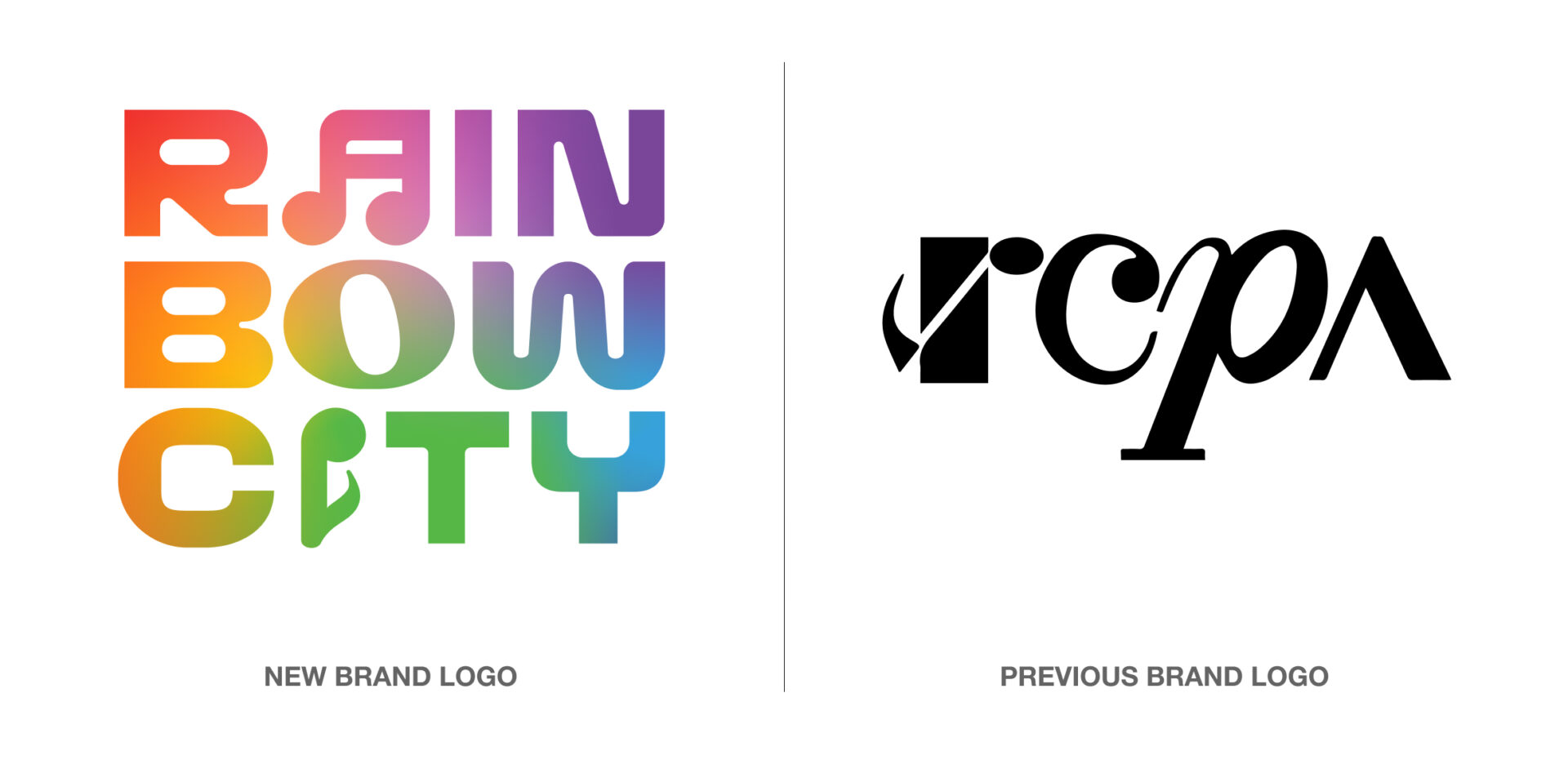
While the organization’s mission had evolved over time, a cohesive design philosophy had not. The original logo was developed in 2004, establishing R-C-P-A as the shorthand for the org. This acronym was meaningful to members, but carried no meaning to new audiences. Some new ensembles had logos, others did not. Ensemble naming did not always ladder up to brand name and resulting logos were inconsistent. Color and broader visual identity was never explored as part of the system.
ONE COMMUNITY
To create a unified brand, the new logo system establishes "Rainbow City" as the umbrella organization name for easy brand recognition and a full spectrum color scheme is used to represent the whole community. To provide distinct identities within the org., each ensemble now has a consistent naming structure and a sub-logo, color gradient and symbol representing the music genre that they perform.


A FULL SPECTRUM OF DESIGN CHOICES
To ensure cohesive materials that support Rainbow City performances, we delivered a robust kit of parts, designed to make it easy for a volunteer marketing team to achieve success.
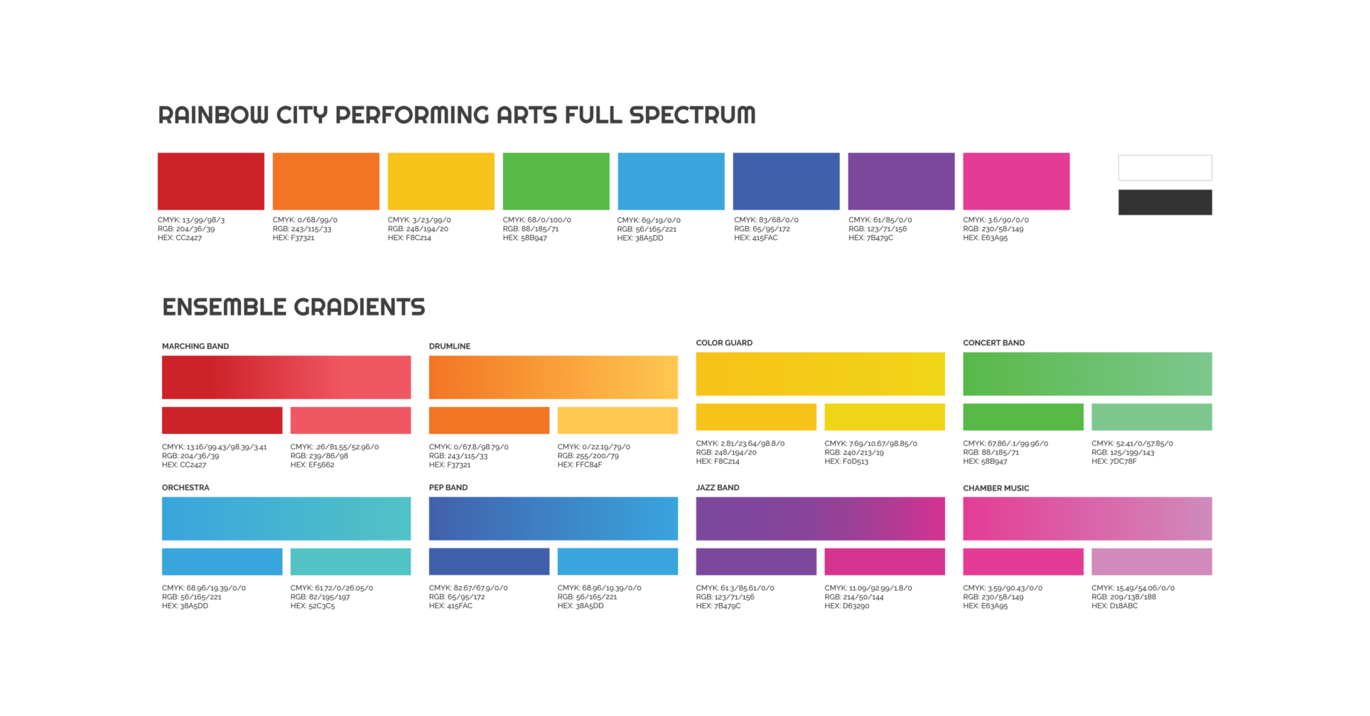
Color Palette. The color spectrum was based on the original 6 colors of the Pride flag + the 2 colors of the trans-Pride flag. Each ensemble has not just one color, but a mini-gradient of 2 colors for distinction.
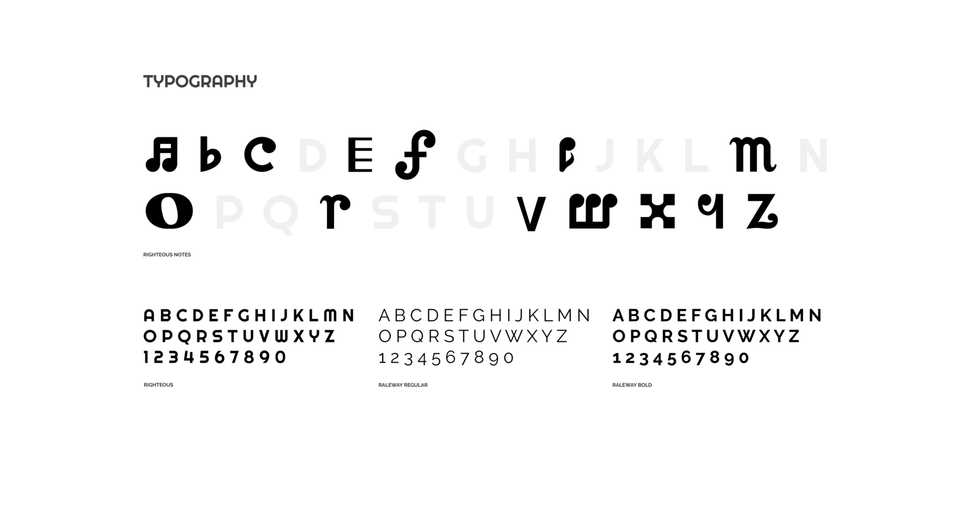
Font. Righteous is used as the primary brand font because as a free Google font, it is accessible to everyone and visually brings in the news poster gestalt from the 1930s. We designed a custom music font to be used in headlines to weave the logo concept throughout new marketing materials.
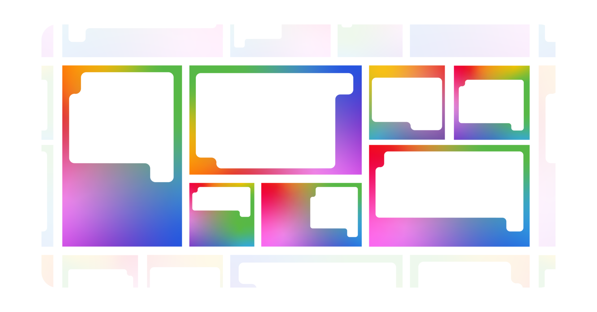
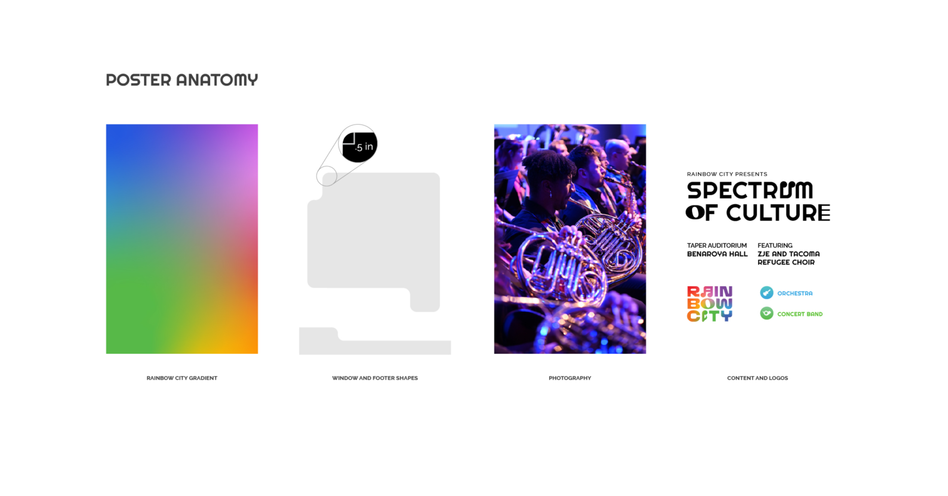
Brand Frames. Distinctive frames for photos or fields of color bring immediate brand recognition with minimal effort when creating any creative asset.
Brand Guidelines. In order to present a cohesive identity across all media types, we created an easy-to-read brand document to assist volunteers creating quick-turn marketing materials.
EASY-TO-USE TEMPLATES
We set up a series of templates that could be used by design volunteers to create marketing materials that stay visually consistent in an affordable manner. Now posters, signage, programs, mailers, web assets, and more, are able to be quickly and painlessly produced for any event or purpose.

RILEY McCORMACK
PRESIDENT AND BOARD CHAIR