A REBRAND DESIGNED TO SCALE
A Puget Sound institution since 1973, Schwartz Brothers offers a wide selection of artisan baked goods to wholesale and retail customers throughout the Northwest. To compete more successfully for limited shelf space and expand into new markets, they needed to create a more modern brand and bolder packaging sets that still echoed their founding culture and values.
A visual brand and modular retail packaging system were designed to support dozens of SKUs and be economical to produce in both large and short runs. Minimalistic and clean, the new look creates a strong branded shelf presence with a sense of quality and tradition that has fueled the company from their very first batch.
- Discovery + Research
- Competitive Analysis
- Logo
- Visual Identity
- Brand Guidelines
- Packaging Design
RISING ABOVE THE COMPETITION
We began with an audit of category competitors and walk-throughs of retail environments in the current and future markets. We then evaluated the attributes of the Schwartz Brothers brand, the current customer persona, the target demographic, and the requirements of retail and wholesale partners. The opportunity was to differentiate with a humble and approachable brand: Small-batch products that are meant to be enjoyed and shared every day with family and friends. Whether it’s cookies for the soccer team, bagels for weekend brunch, or croutons for weeknight salad, we wanted to build affinity with shoppers looking for reasonably priced, wholesome products created from thoughtfully-sourced ingredients, and scratch recipes.

LOGO DESIGN
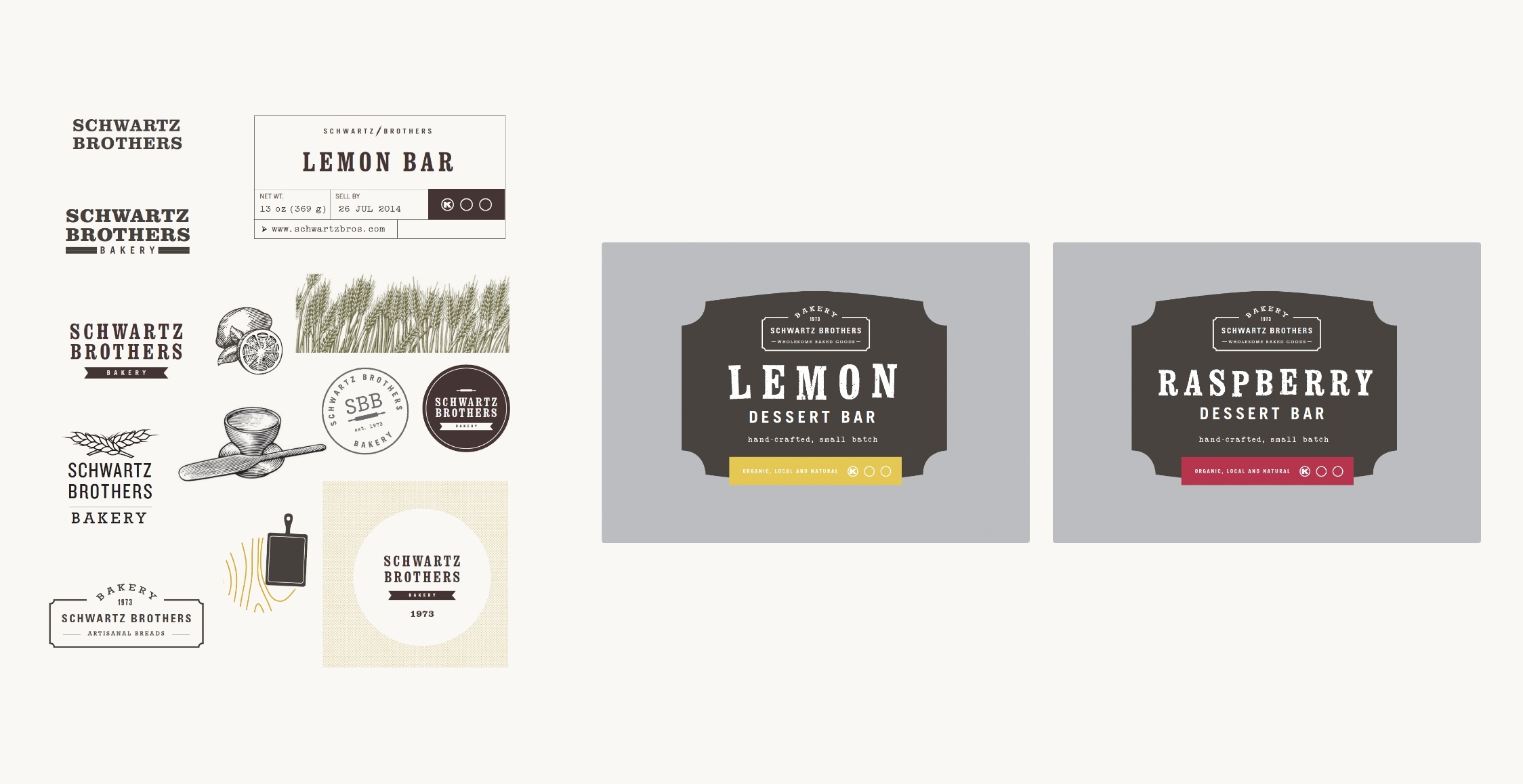
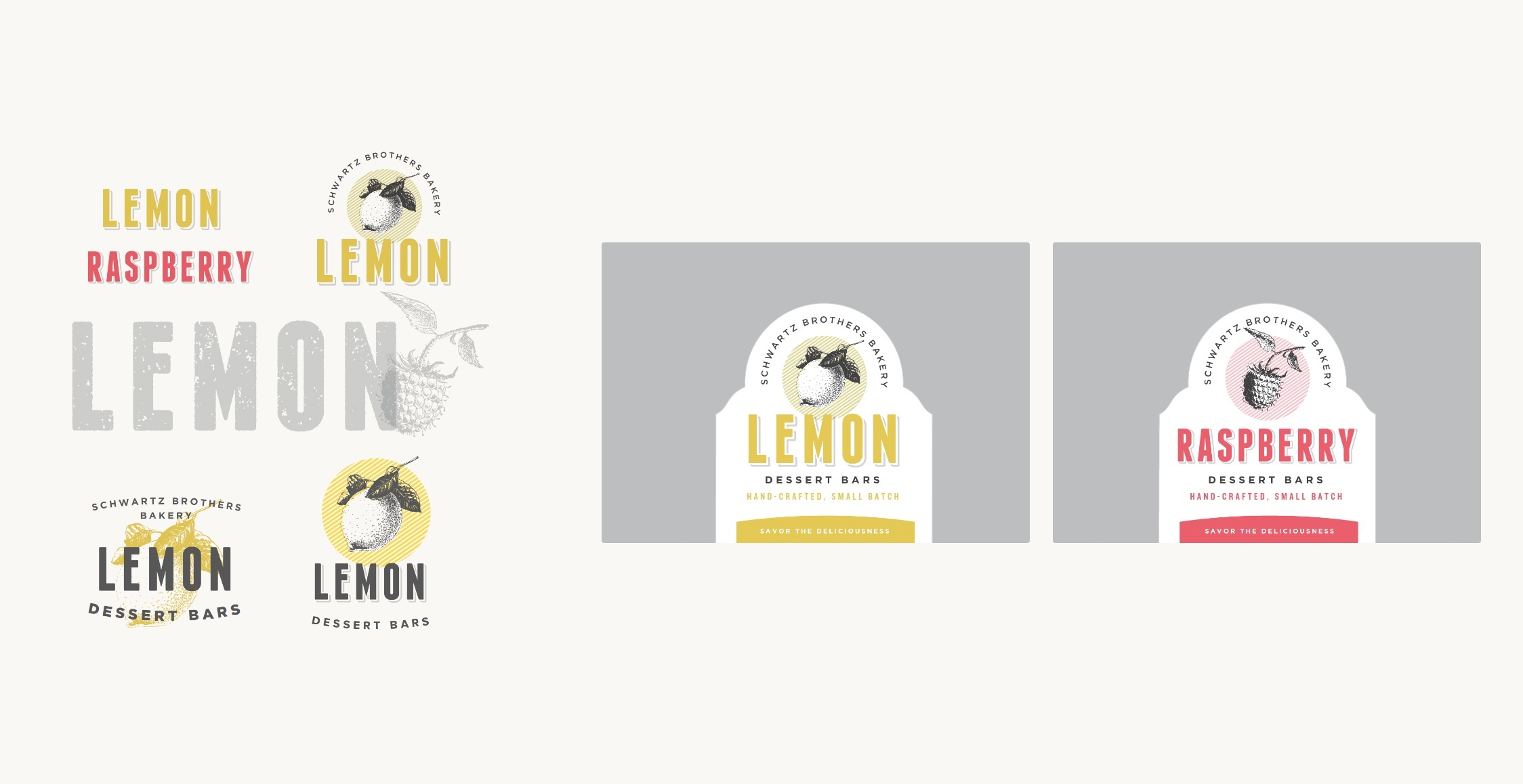
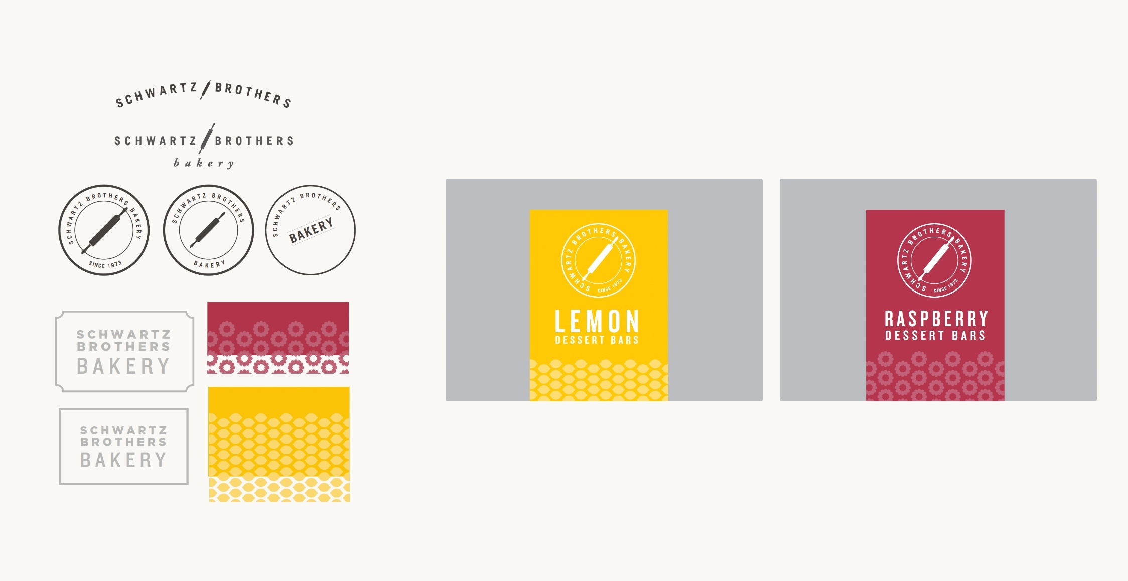
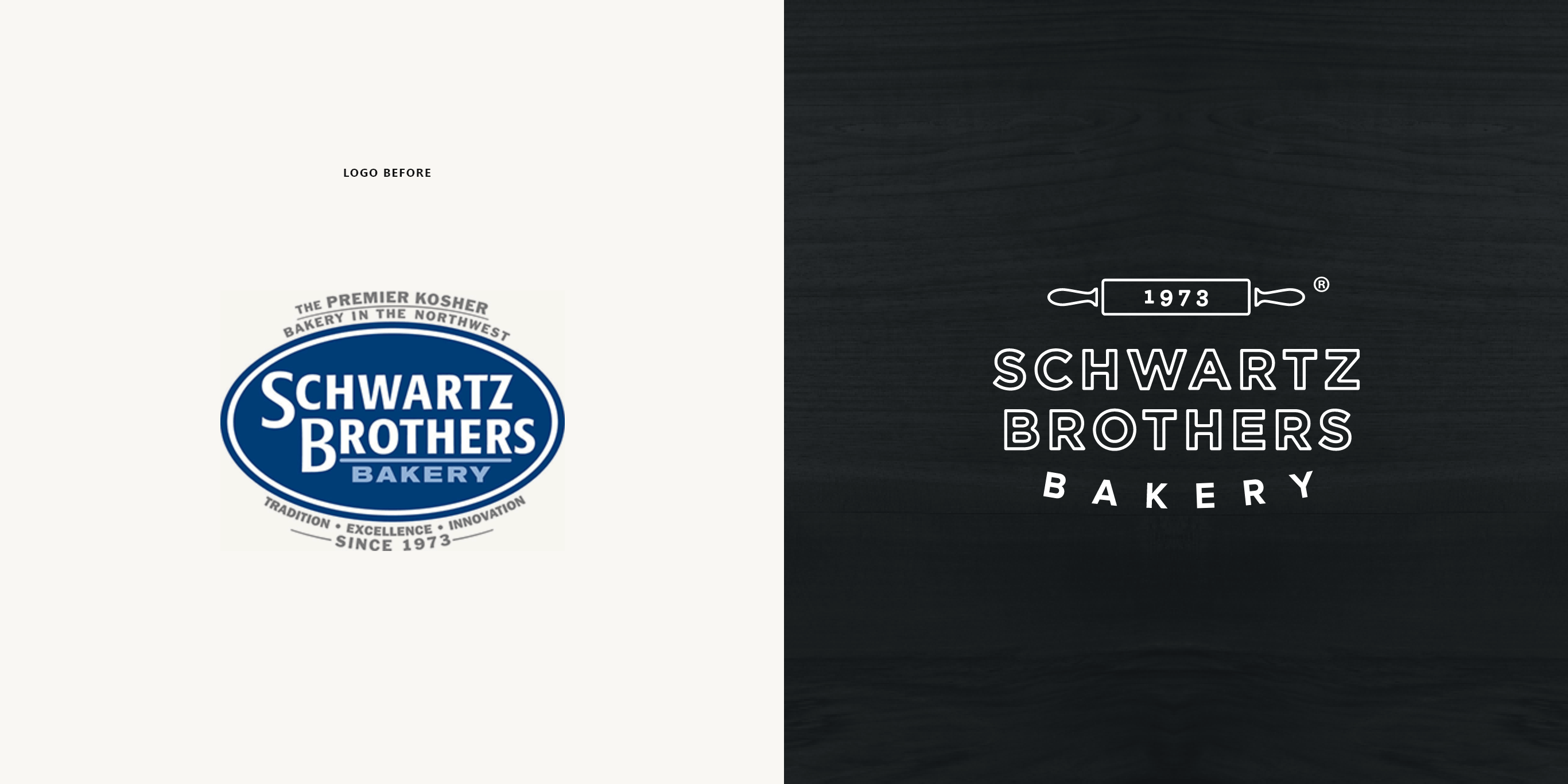
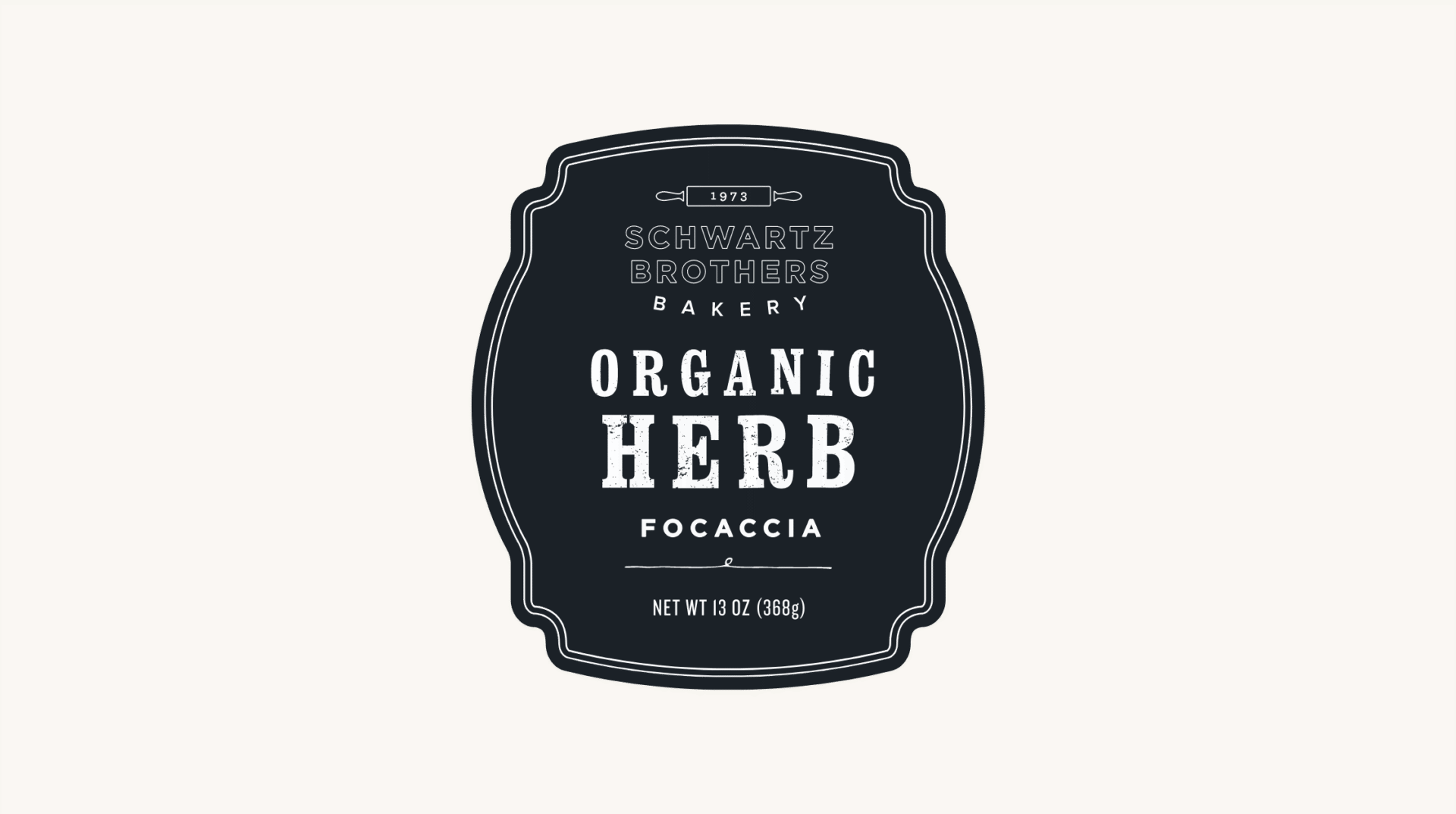
While the old logo had served the company well, it was unsuited to symbolize the new brand strategy. Brand style boards were created to evaluate the viability of a broad range of logo lock-ups and supporting visual elements that would create the foundation of the new brand. The resulting logo is contemporary, but with a nod to the tradition that differentiates Schwartz Brothers from the competition.
PACKAGING SYSTEM
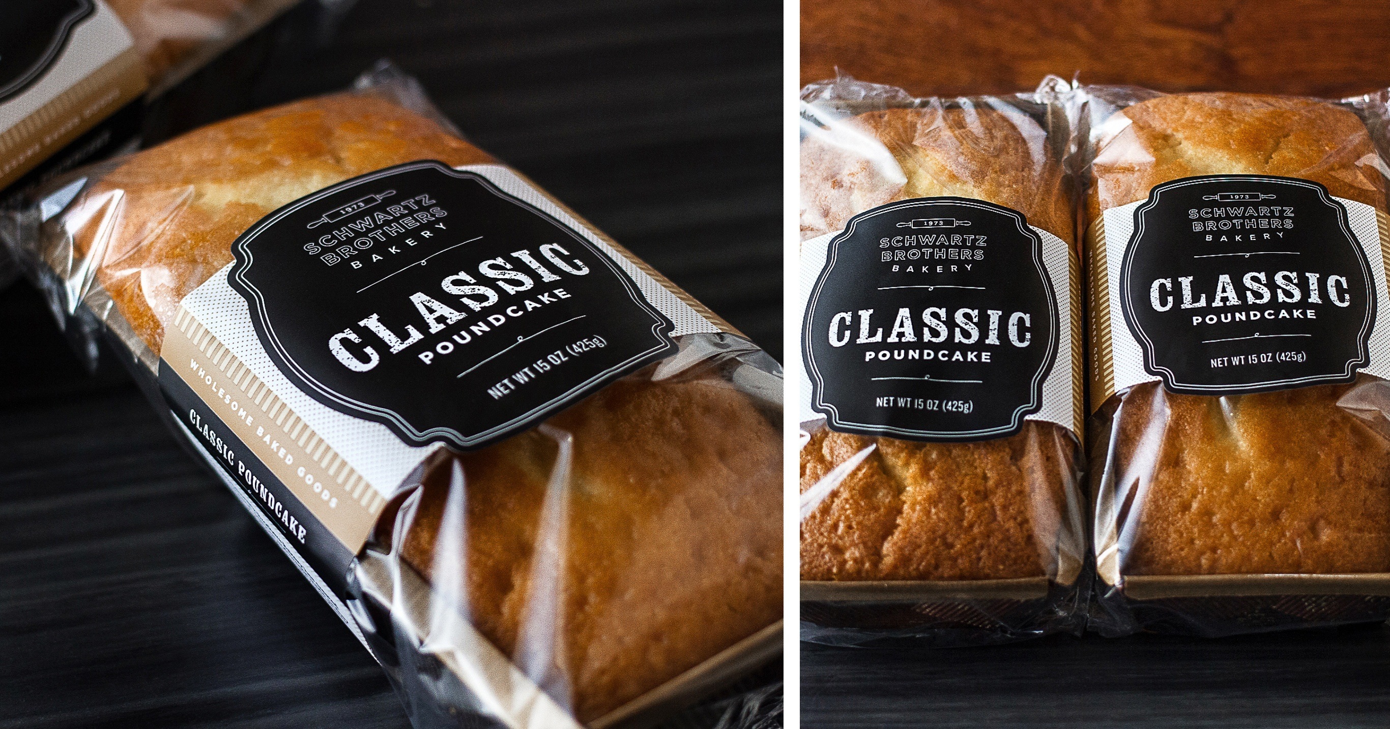
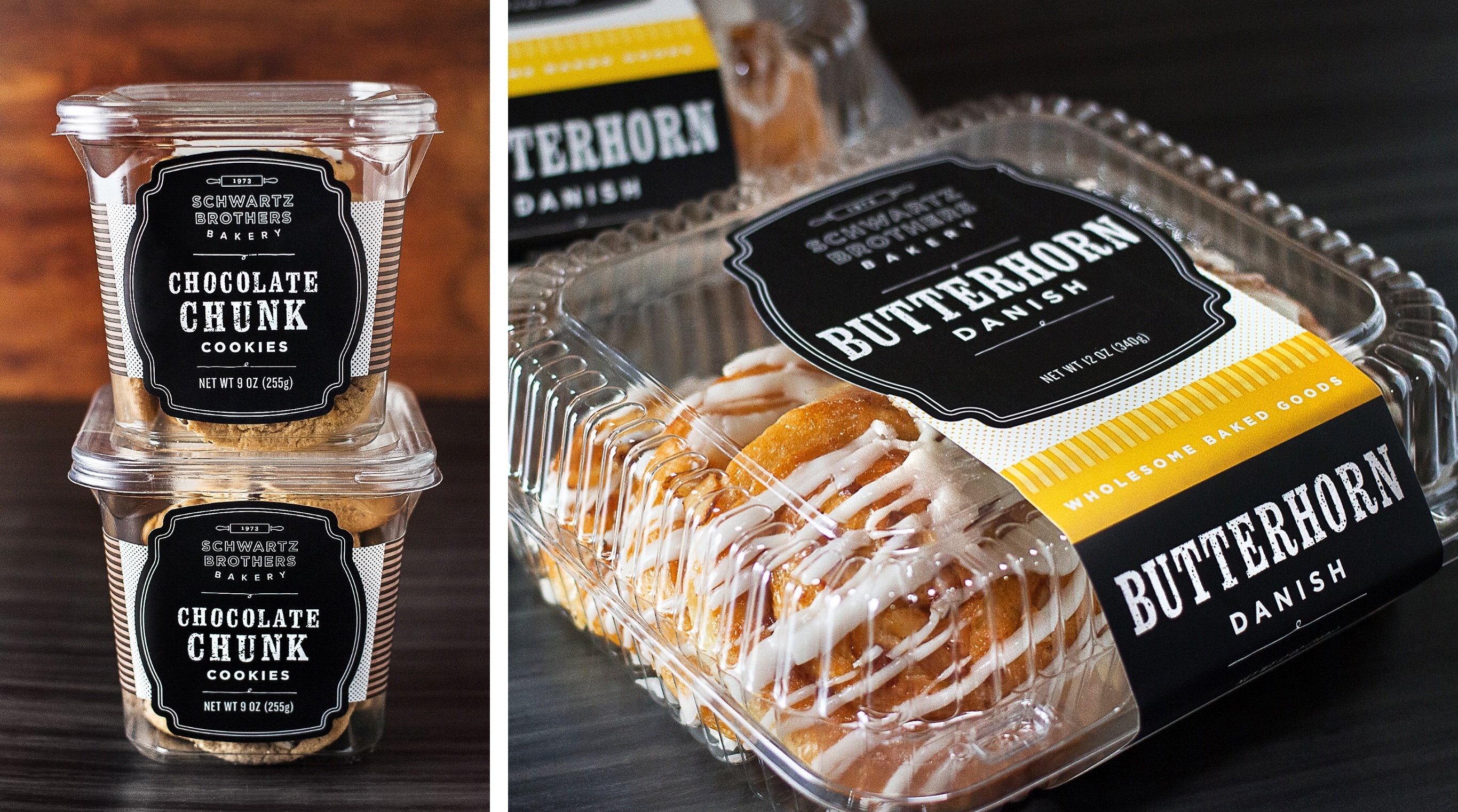
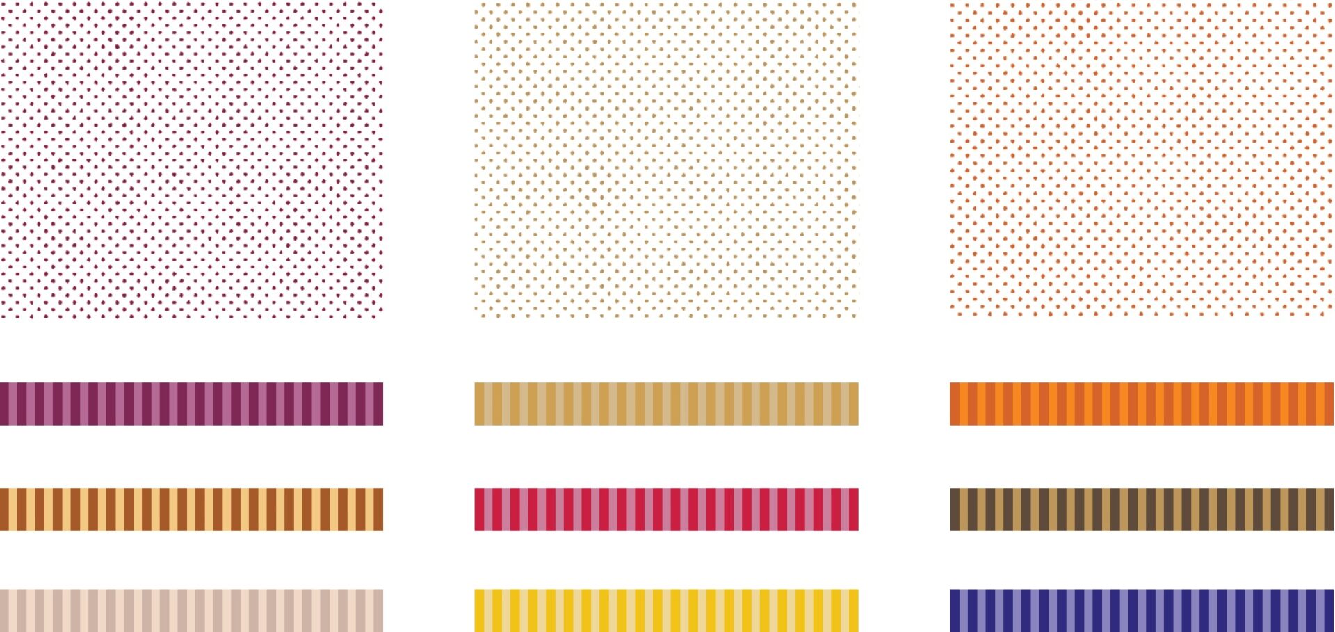
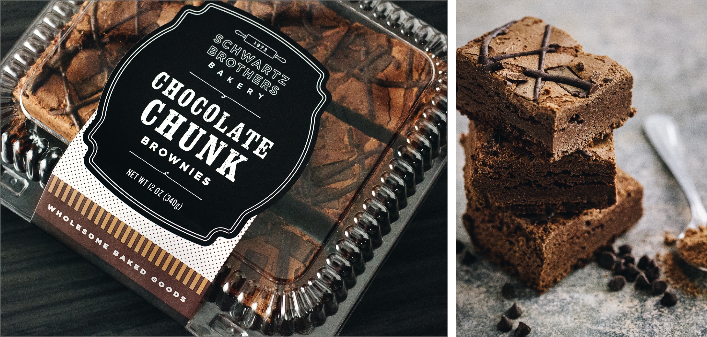
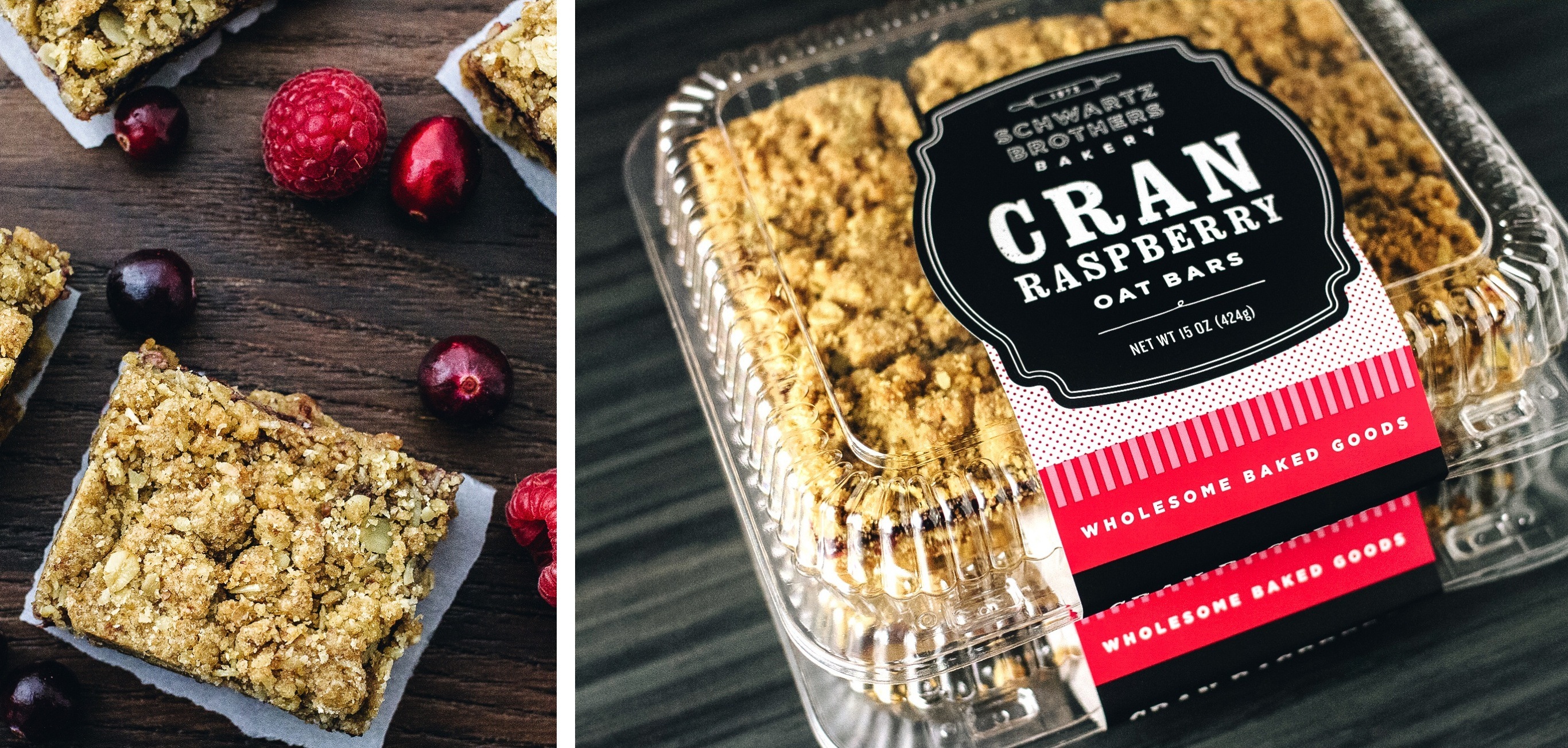
Schwartz Brothers products require diverse form factors with new products and line extensions added frequently. The packaging solution is a modular “kit of parts” that is easily reconfigured to adapt to new packaging needs, while being cost-effective to produce. The dominant black badging unifies the brand in shelf sets, and the friendly bright colors differentiate flavors for shoppers.


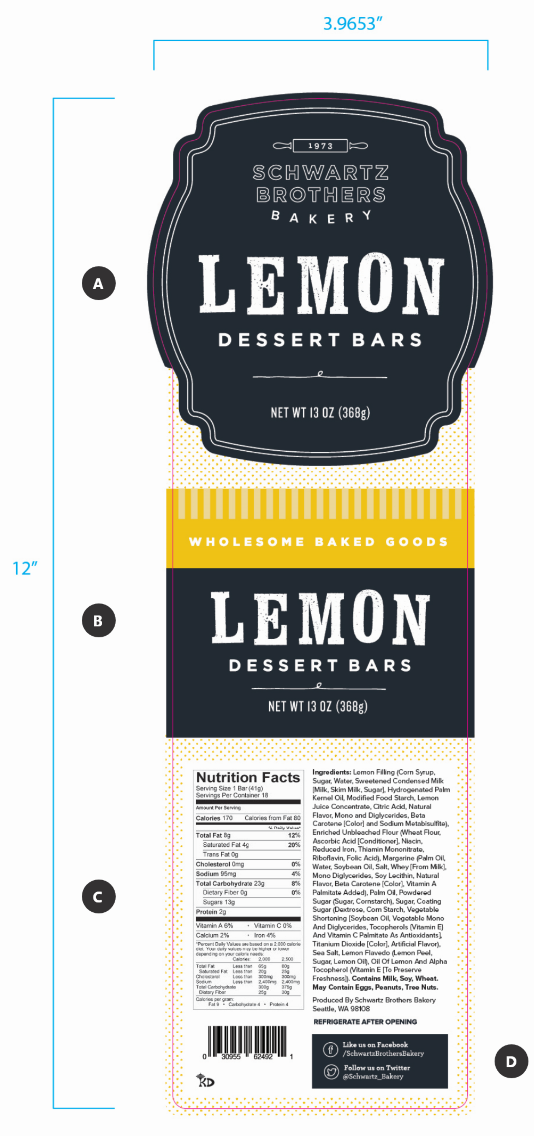
A. TOP VIEW
Custom label shapes and dominant brand badge creates visual consistency across all products and packaging.
B. SIDE VIEW
Flavor-specific color assignment provides quick visual product recognition for shoppers.
C. NUTRITION PANEL
Designed for FDA compliance and space economy.
D. COMMUNITY
Social media links are featured to provide an opportunity for customers to connect with the brand.
Lindsey Schwartz
CEO


